Methodology
Horizon team sculpted their own non-linear process for developing the system as it is now. It was an iterative process that involves developing an understanding of the system as a whole, analysing the individual components, and then iteratively refining the design to meet the desired objectives extracted from on going research during each phase. This approach was particularly effective when used to develop MVP system that required a large number of testings and iterations.
Literature Research
Kicked off the process by basic understanding of controls in car divided amongst secondary and primary interactions. Also the team began exploring naturalness in driver car interaction and what could make interactions unnatural in new developing systems. Once the team had insights we began clustering them into through the tool of affinity mapping in order to get more concrete direction on the process.
Digital Ethnography
Goal here was to segregate primary and secondary interactions and highlight user pains and needs through data gathered from car forums (BMW, Tesla, Rivian, Mercedes, Honda, Audi etc.) reddit forums on car experiences and youtube video comments regarding car experiences.
Comparison of frequency in problem area clusters between primary and secondary. The frequency of secondary was found to be more problematic than primary since companies tend to digitalise them whereas users understanding of safety, good experience and naturalness is more attached with weighed controls that include some sort of recognisable physical feedbacks. Therefore the direction here onwards focused on secondary infotainment controls.
Scraped significant problem areas from secondary and traced back the user data of how they described the experience in positive, negative or neutral way so that the team can sift out intervention areas for our design solution.
Interviews
The teams goal now was to identify user pains and needs as well as users understanding of naturalness in driving context. We piked various users of different age groups at this point also to keep our target user selection open for now. Visualisation of user pains, needs and design opportunities was made through a mental model diagram allowing to empathise with the user and their understandings.
First-hand experience
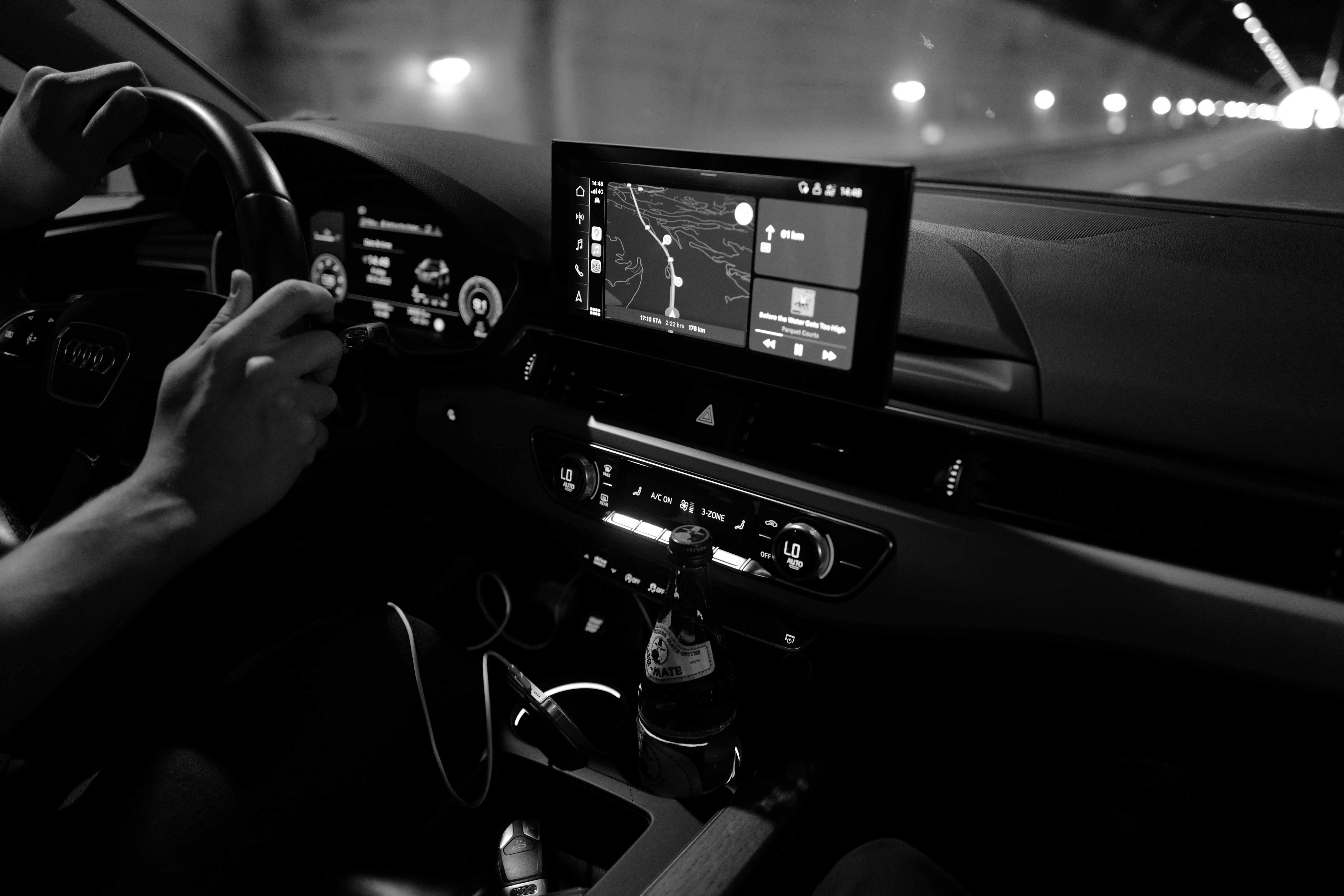
The team wanted to look at the problem areas and confirm the hypothesis by being in context as our users. Hence, the empathetic experience was made using 1000km journey made using Audi A4 Avant 2022. Throughout the journey the driver from the team spoke out loud about his problem areas or wherever he felt barriers in achieving tasks, affecting naturalness in interaction.
Overlapping insights
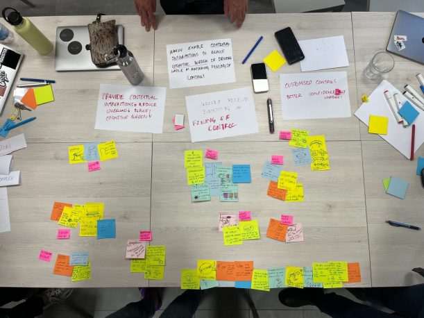
With all the raw data and clusters gathered we now approached synthesising these results. Interviews, digital ethnography, literature search and empathy gathering results were then clustered and matching insights led us to reach design hints.
How might we provide contextual interactions and reduce overflow of controls and to reduce drivers’ cognitive burden while driving?
How might we provide customisation of controls which provide autonomy and confidence to drivers’ actions?
How might we include driver in the loop of decision making of adaptive interactions which facilitate in performing primary driving action?
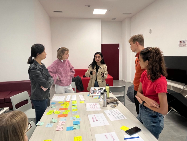
Design team discussion on feasibility of the solution in order to pick the problem statement
How might we enable contextual interactions to reduce the cognitive burden of drivers while maintaining the feeling of control?
Minimised controls according to needs. Multi-purpose interactions used contextually.
Secondary interaction elements on cars can lead to an overload of information and driver distraction.
Drivers don’t want the car to make decisions for them, and feel familiar with the vehicle.
Value proposition
Moving from research insights and a design question for the team we directed the process to head towards a meaningful solution.
Concept Brief
Vividly having user pains and needs ahead of us and the value of our product or service helped us develop a brief for the upcoming weeks. This was the funnel point from research to design for us, however research never stopped, wait till you see more.
Design a contextual interaction system that minimises cognitive load and maximises driver control
Concept Development
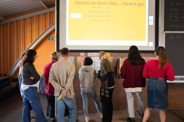
Days and days of ideation around three key goals: contextual interactions, minimise cognitive load, maximise driver control. We developed separate ideas for each through quick Crazy 8 activities and then clustered the ideas in order to give the system a visualisation.
Concept Exhibition
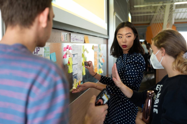
3 concept designs and around 50+ peers to review it for us. The team took all the feedbacks and improvements and set the goal to develop the concept after this exhibition for design detailing of the solution.
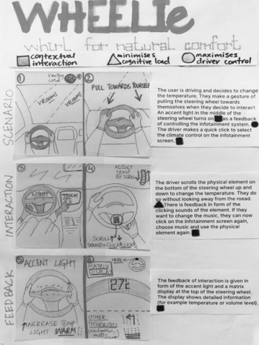
- accessible controls
- steering wheel placement
- matrix and light feedback
- familiarity with old system
- focus on primary
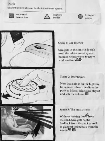
- habitual gestures
- gearbox placement
- resting arm accessibility
- rotary control
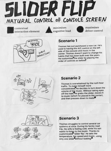
- familiarity with old system
- central placement
- scalable
Field Testing
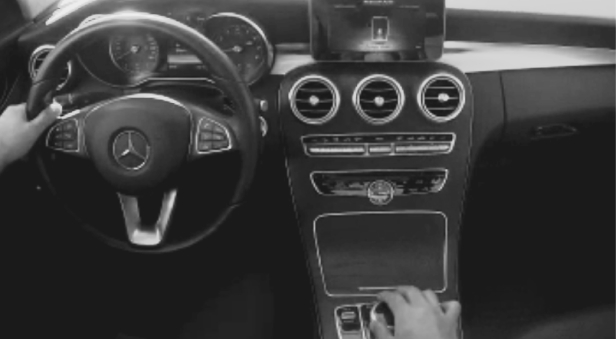
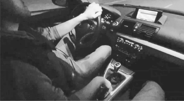
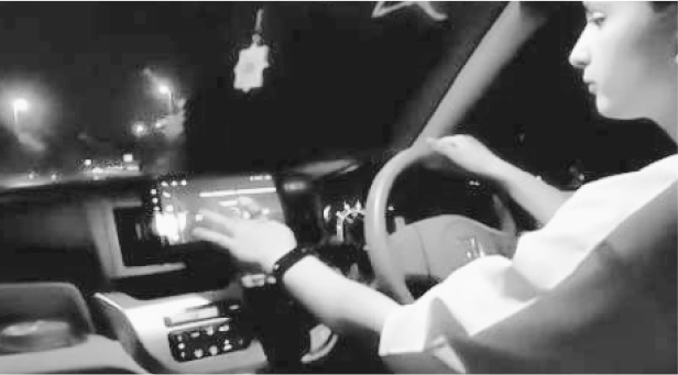
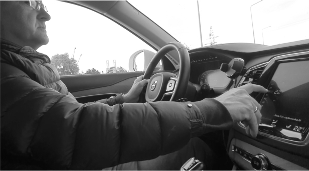
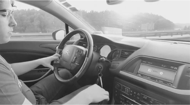
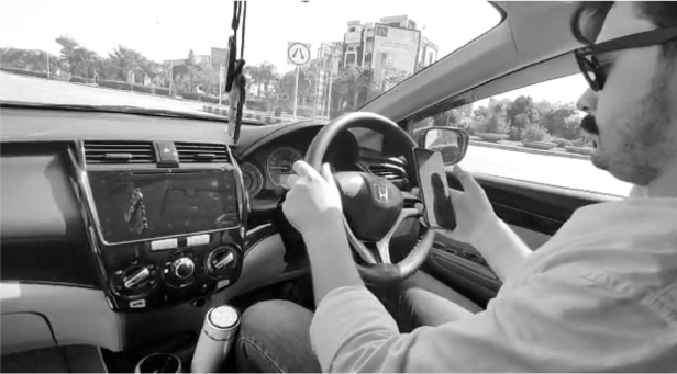
Bet you had been waiting for this moment, yes the team went back to investigating on user research. This time to empathise with the user in their comfort driving situation of different scenarios (night and day), different contexts (highway and local everyday tasks) and different placements of infotainment controls (steering wheel, gearbox controls, master display controls).
Benchmarking
Investigating in depth current car systems and secondary controls placements varying from minimal to complex. Conclusion: less is not always more, the perfect system is a good balance of physical and digital controls placed in a predictive and familiar way.
Naturalness framework for secondary controls
Once we knew our placement, answers to user needs and pains we went back to the frameworks used for naturalness in secondary controls in order to have a deeper look into what attributes we are answering and what we further need to explore for design detailing.
Positioning
conclusion form this step back into research was the positioning opportunity for the solution in current market. The aim was to provide users with a natural interaction built through muscle memory, that keeps their focus maintained and maximises their control over the car system
Identity
The line where land meets sky. Focus.
The desire to explore beyond our current perspective. Control.
The feeling of something about to happen. Safety.
Solution, Experience, Meaning
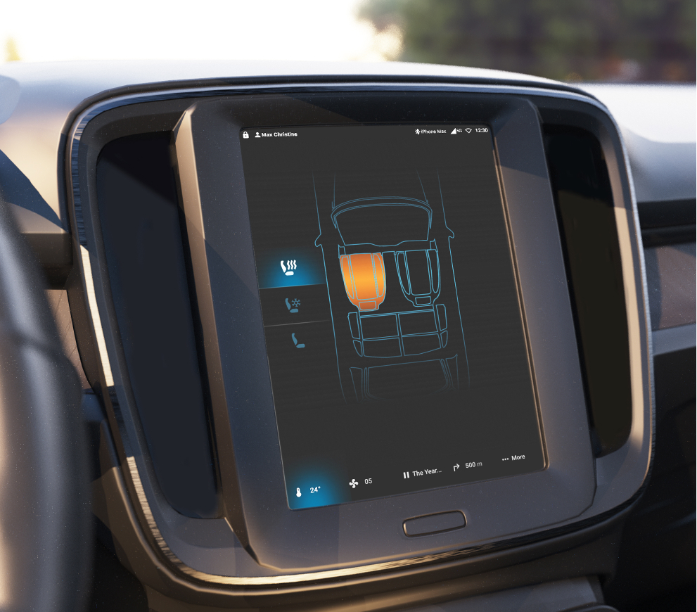

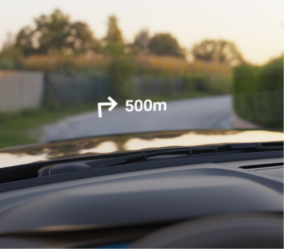
User Flows
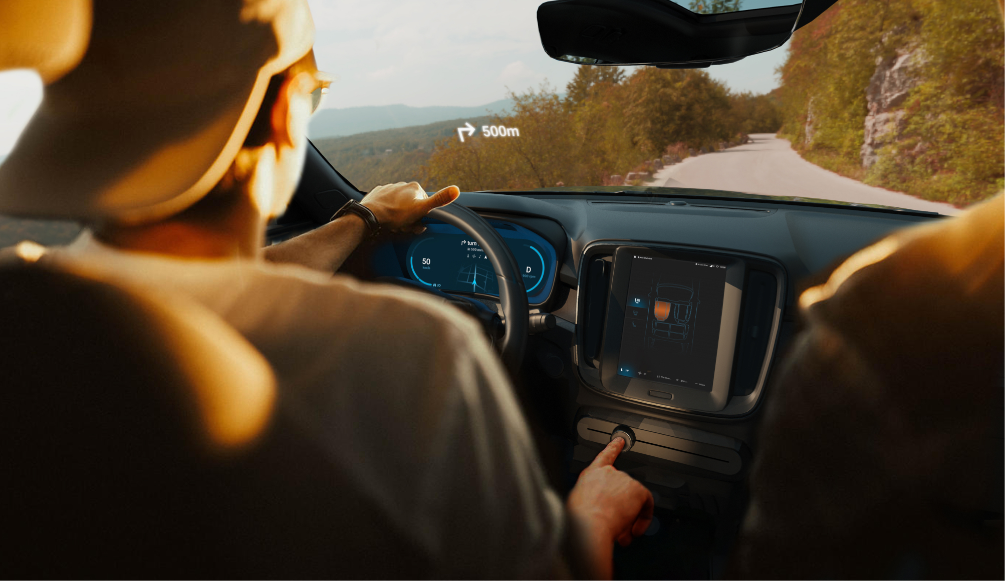
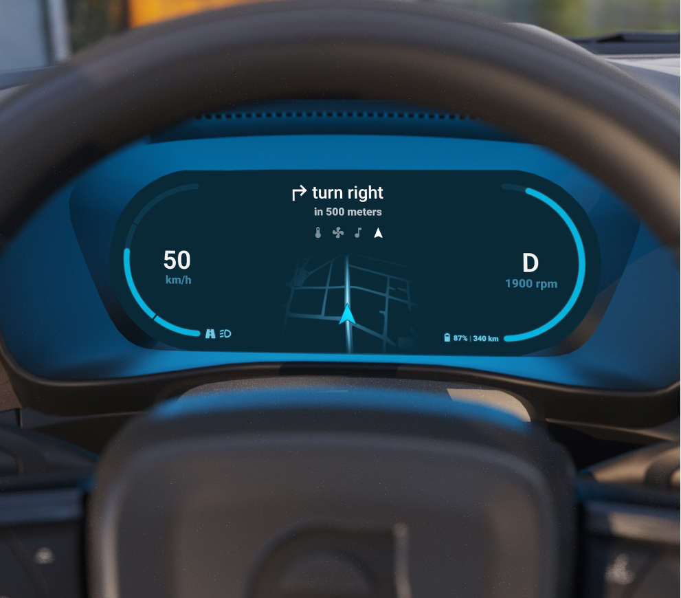
After analysing system defaults the team also structured user flows for these possible defaults and brainstormed other flows that might not be part of the defaults. In order to justify the contextualisation feature of Horizon the flows had similar interactions however functionality of interaction changed between the flows depending on the context.
Testing and iterations
1st round: Interaction testing
- intuitiveness of solution
- audio or voice feedback preference what feels more natural
- sliding interaction
- rotation interaction
- push for on off interaction
- switch mode from music to climate
- turn system(s) off/on
- increase decrease volume/ temperature
- prefer voice/audio before they develop habit for it
- perceived hypothesis of naturalness of control approved
- haptic feedback > voice
- voice for control not for feedback
- eyes on road concept tested
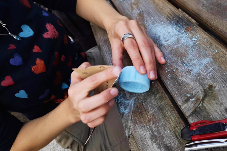
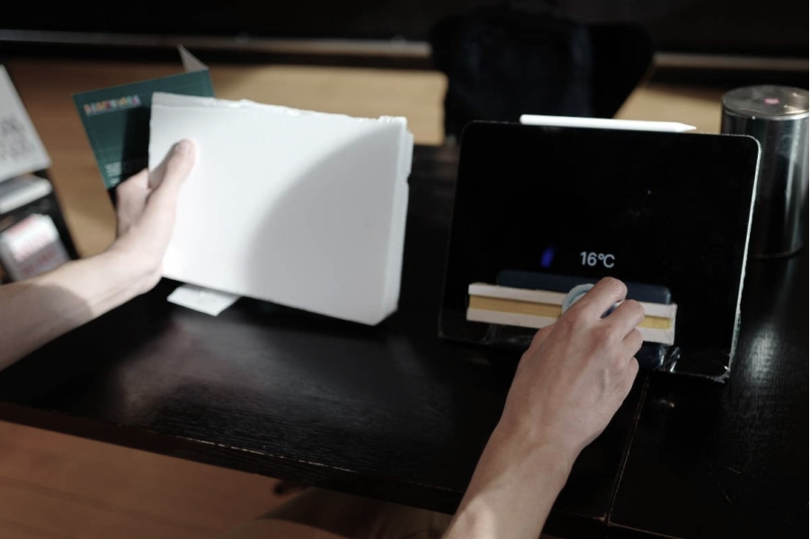
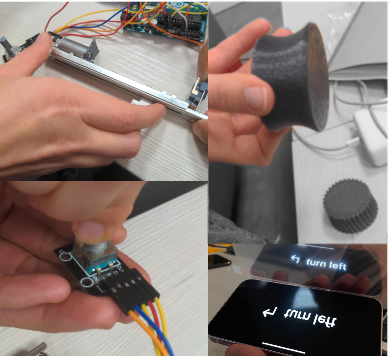
2nd round: Technical system testing
- knob form (texture and sizes) testing
- potentiometer sliding test
- HUD film initial test
- haptic feedback recognition test
- rotation switch test
- increased area of haptic feedback on potentiometer in MVP
- knob with textured surface for next model
- Funnelled sides of knob for better grip
- rotary switch works but needs testing with the modelled form
- adjustment of area under HUD (no phone border etc.)
In action
Go to the next page.
Showcase