What is the big idea?

Eyes on the road | Mind free | Embrace the journey | Enjoy the moment with loved ones

An interactive system that reshape the in-car infotainment controls with both physical and digital touchpoints which provides natural car-driver interaction

What does it solve?
Problem

Lack of control

Cognitive overload

Cluttered in-car controls

Solution

Provide intuitive interactions based on formed driving habits

Integrate contextual controls of in-car infotainment system

Maintain the driving safety by keeping eyes on the road

Who is it for?
Stakeholder

Car companies

Dealerships and garages

Main User

Experienced drivers with budget and willings to purchase a new car

Secondary User

Driving commuters who seek for safer and more enjoyable driving experience

Visualisations

Fig. 7.1: Visualisations done in Autodesk Fusion, Keyshot and Photoshop

How it works

Information Table
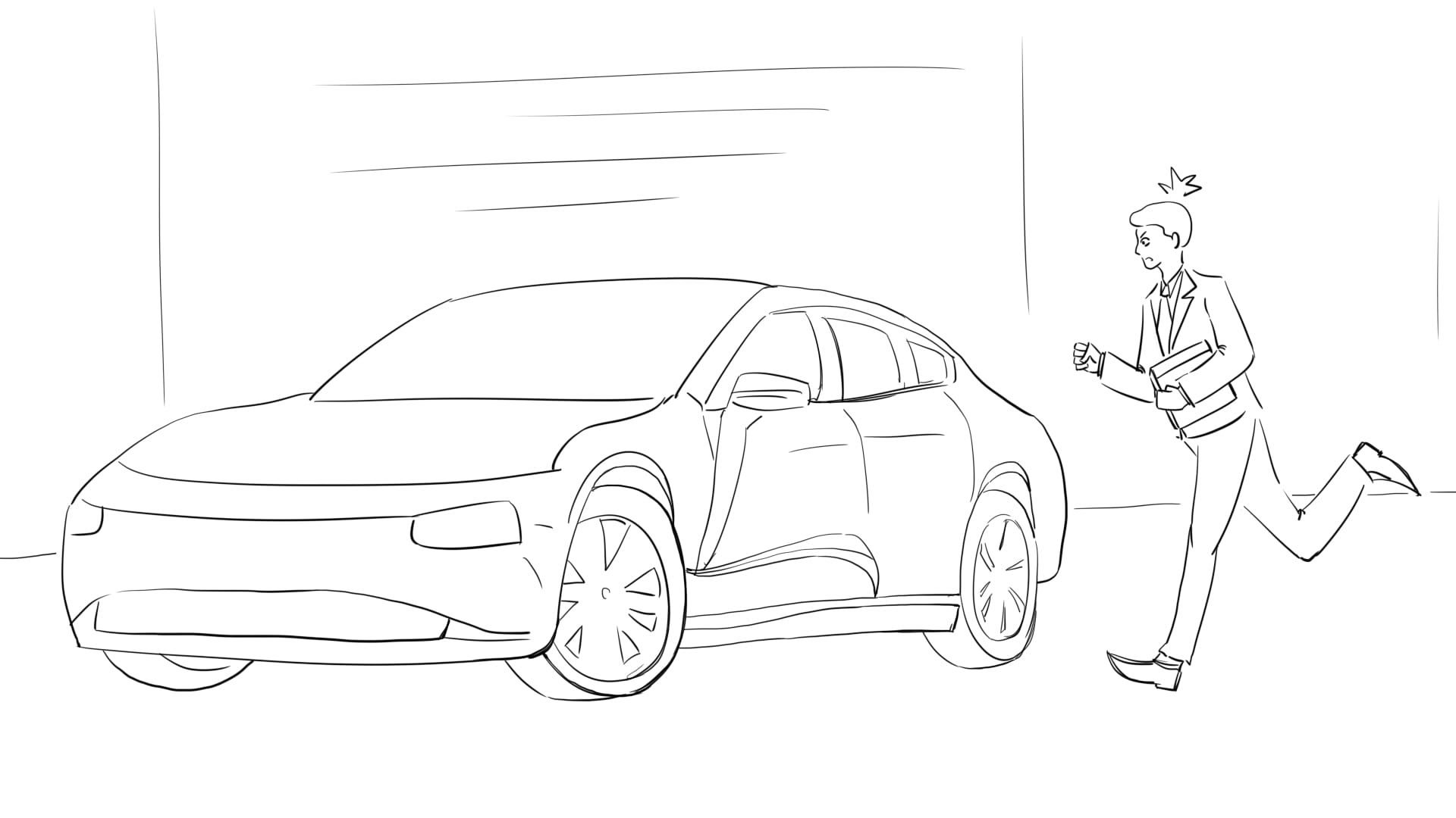
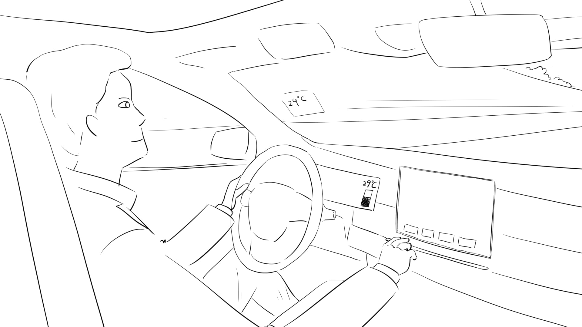
Fig. 7.2: Monday morning, Max is running late for office and enters his car in a hurry.
Information Table
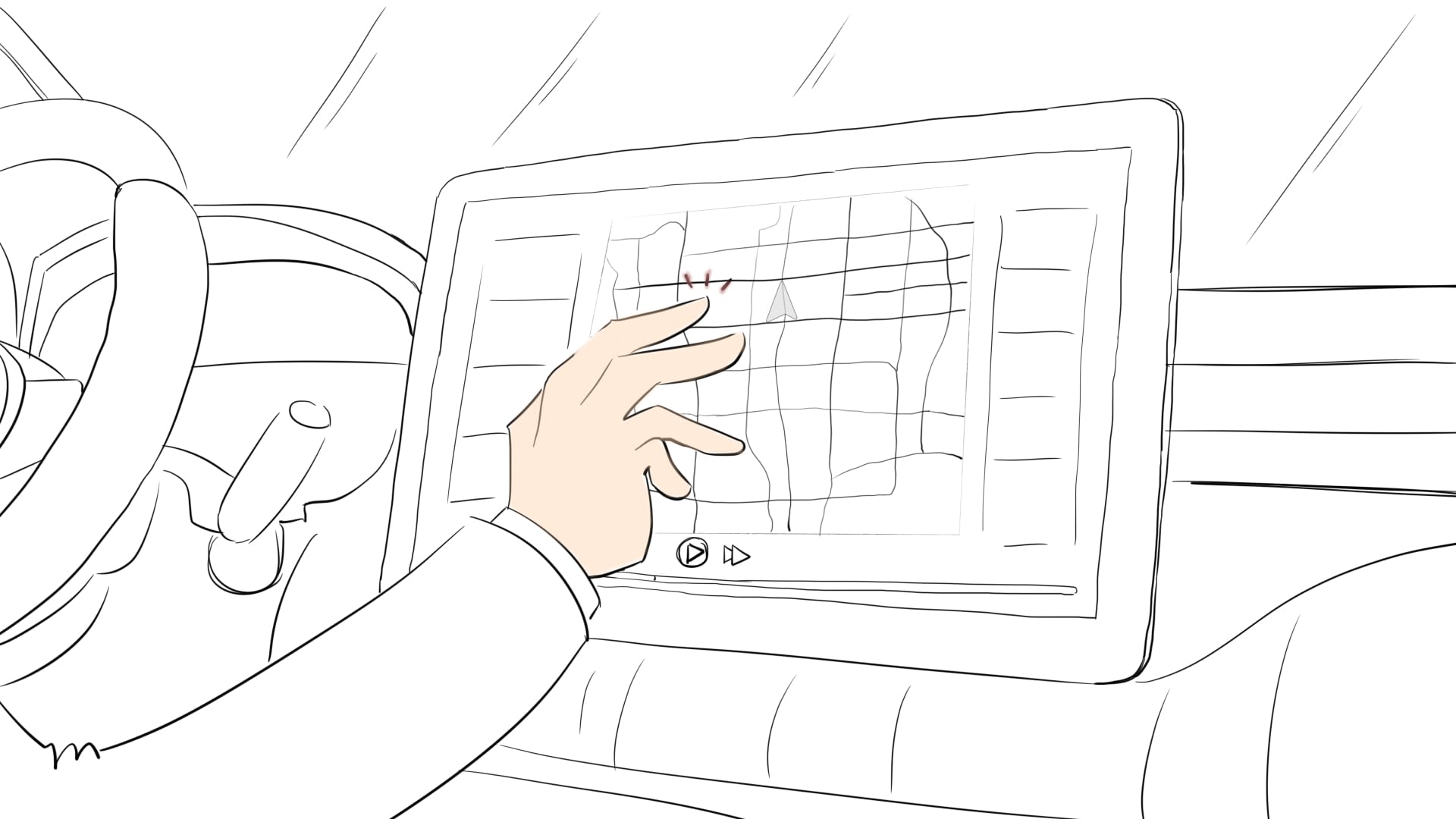
Fig. 7.3: Once he started the car, the central stack showed navigation, he tried to exit the page and changed into music page.
Information Table
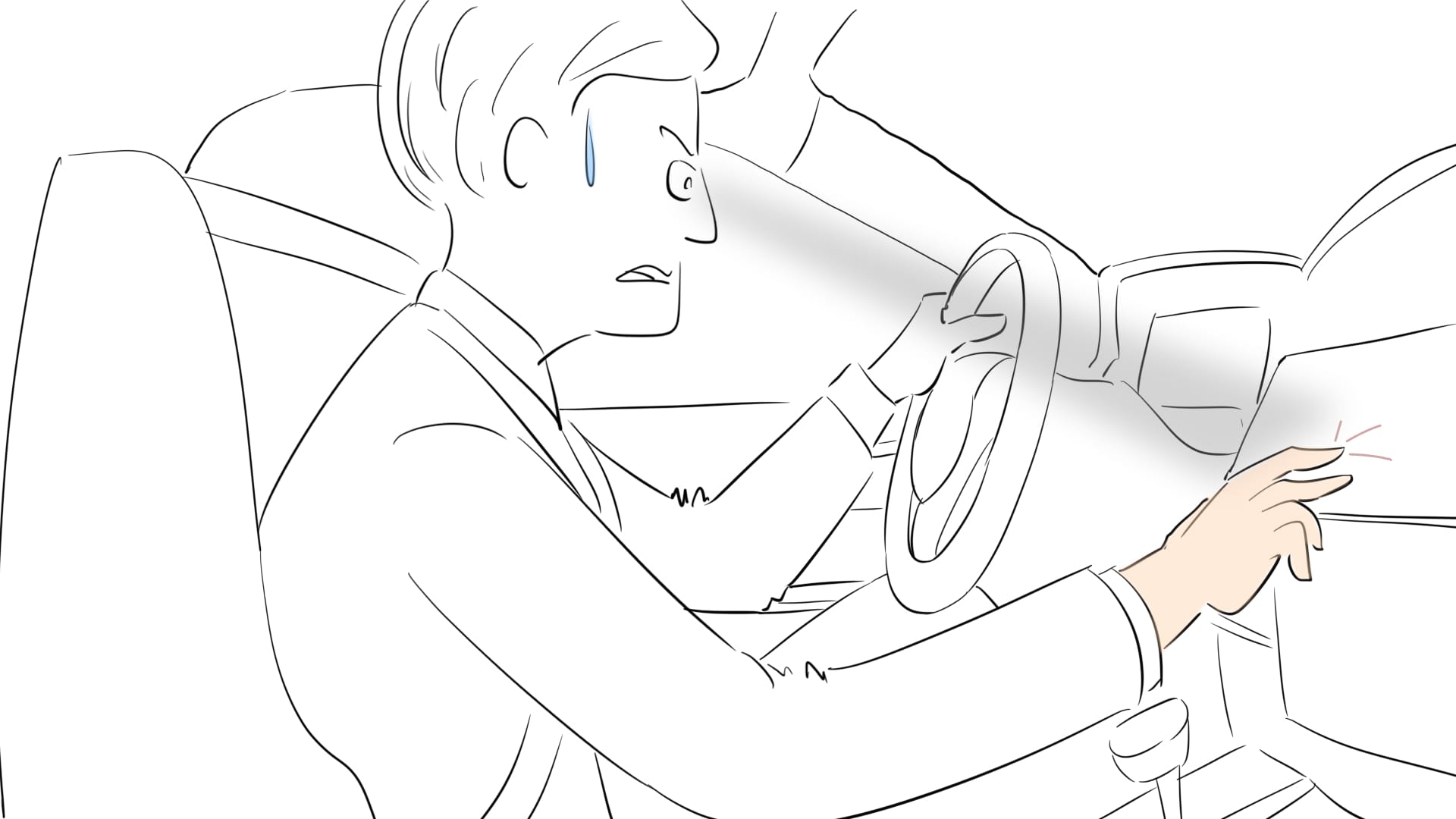
Fig. 7.4: Due to the nested UI system, he can’t make it in a second. Max starts feeling frustrated and annoyed as he’s running late.
Information Table
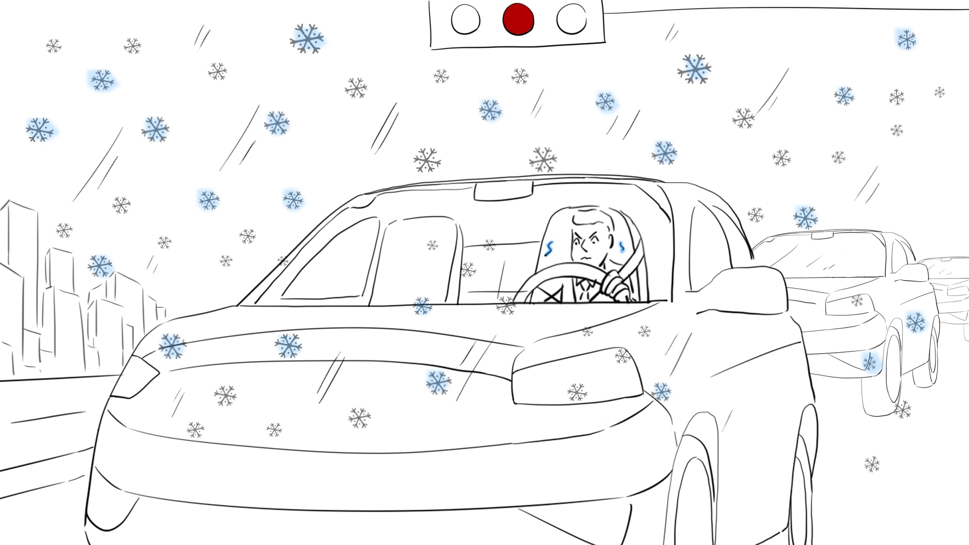
Fig. 7.5: He leaves and it’s snowing outside, Max starts feeling cold and wants to turn up the temperature while waiting on the traffic signal.
Information Table
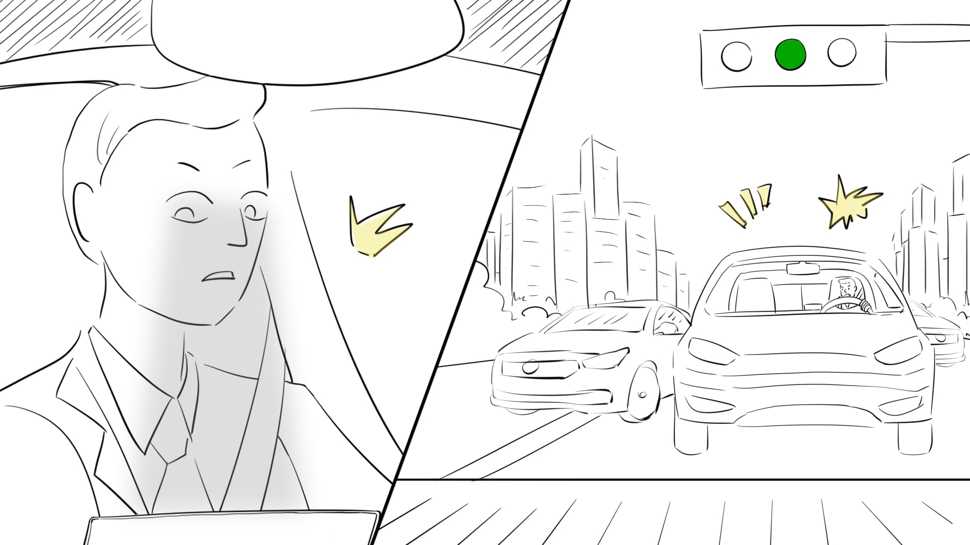
Fig. 7.6: Max has to look at the display, meanwhile he must focus on the road. Suddenly, before he finishes the temperature adjustment, the light turns green and cars around start honking to rush him!
Information Table
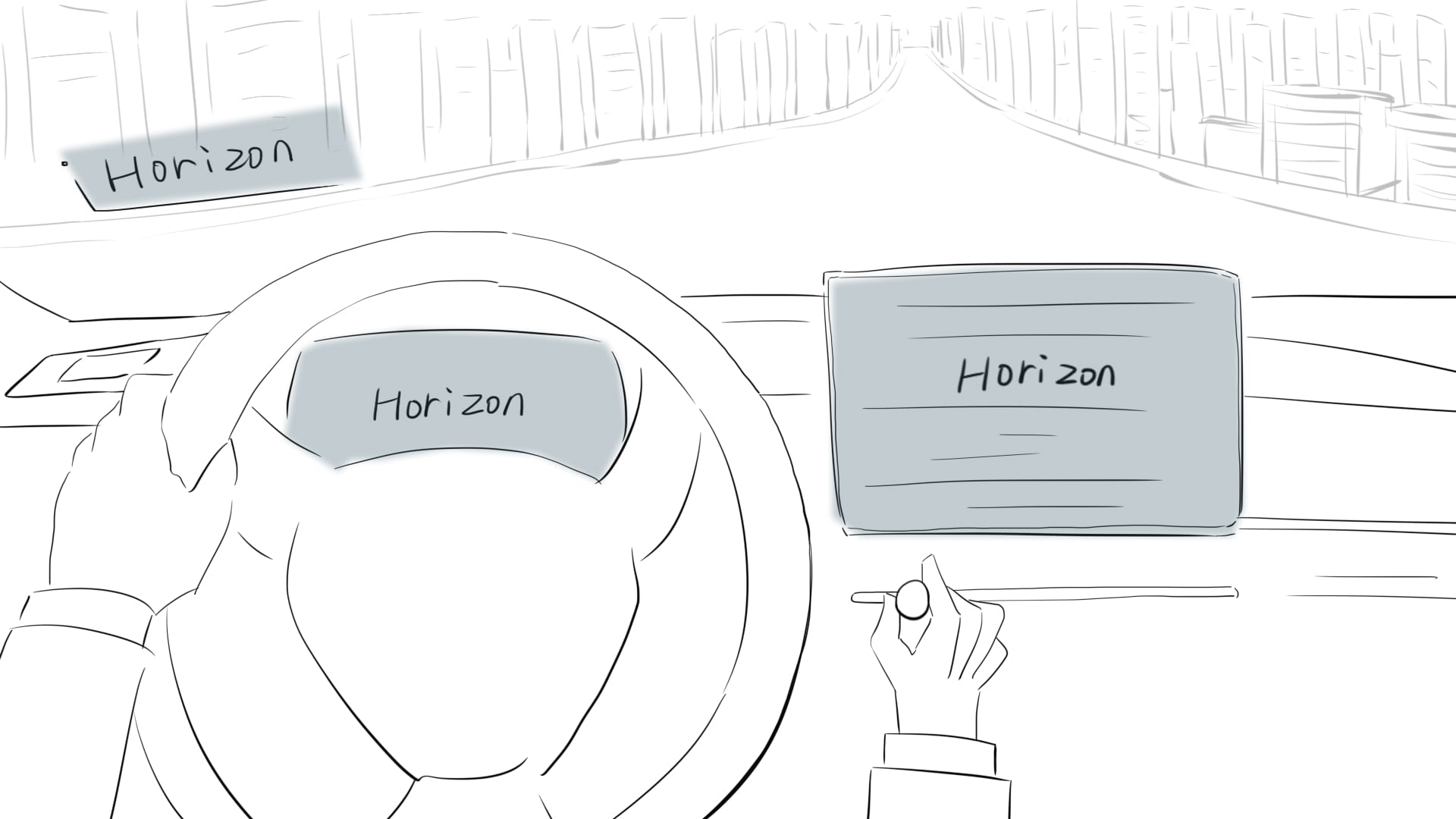
Fig. 7.7: Max tests Horizon system at car dealership. He is informed on the five system defaults. He continues to interact to understand the vibration and audio feedbacks. He feels satisfied to purchase Max gets the Horizon system integrated to his car system.
Information Table
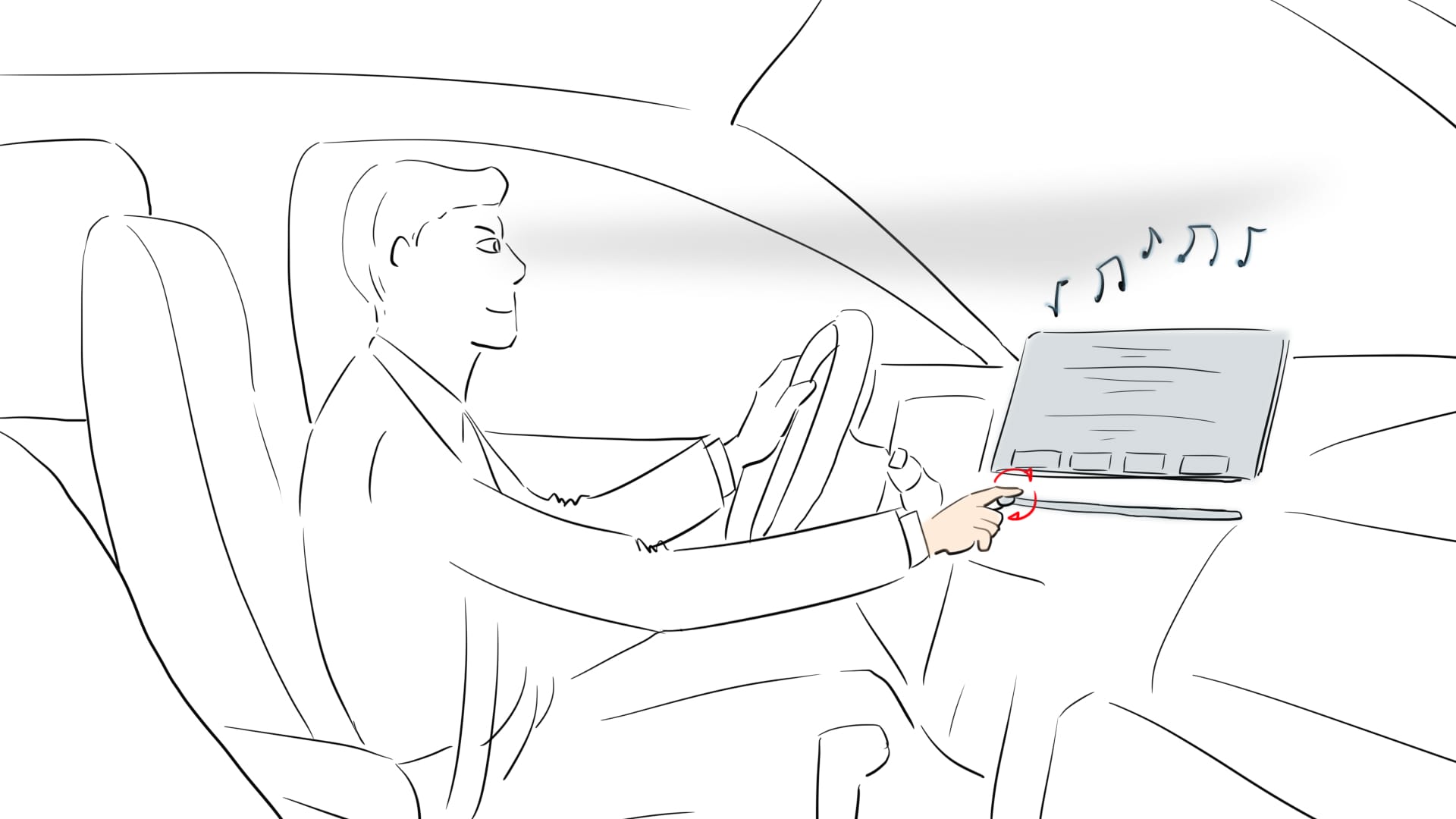
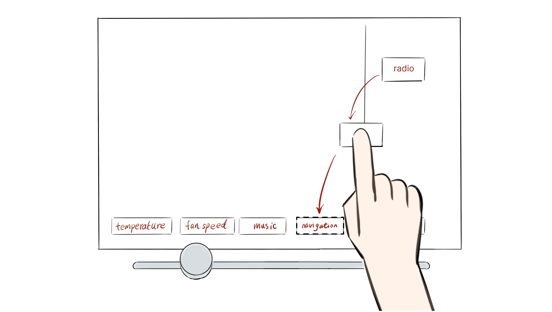
Fig. 7.8: He onboards his car and reduces volume of radio playing with the knob since he doesn't have to do it through touchscreen.
Information Table
Fig. 7.9: He feels cold while waiting at the signal. The signal turns green and while accelerating, he uses his right hand slide the knob to temperature and receives vibration and visual feedbacks (HUD,Cluster) to acknowledge his action.
Information Table
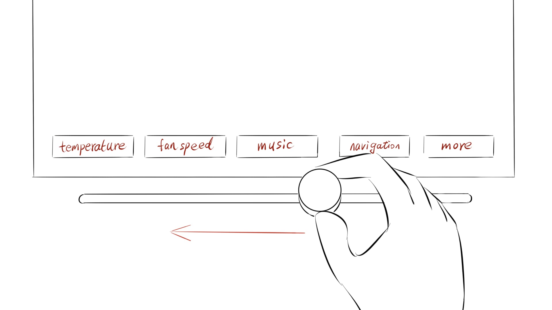
Fig. 7.10: Max realises he doesn't really use the navigation option as often as radio and for radio. He decides to customise to his needs, slides to the last menu more option on the slider knob and customises. Slides knob back to old navigation point and is happy to see radio instead of navigation!
Information Table
Fig. 7.11: Max is building muscle memory over time with the Horizon system and is able to control his favourite radio channel and temperature while driving to his office during a rush hour.
How we enter the market

Collaborated with car companies, providing customised Horizon system for specific car type

Upgrade the secondary infotainment system for individual car owners

How we measure success

Recognition of the different interactions (press, slide, rotate)

Focus on primary task whilst operating Horizon system

Technical testing of MVP (haptic, audio)

Why might we fail?

System compatibility issues

Target users are tired of existing in-car controls so that lose trust for new system even before purchasing

How did we prototype and test?

First prototype

physical prototyping | wizard of Oz | shape

Test the types of interaction: slide, grab, press

Test the visual and audio feedback

Test the forms of slider knob

Placement testing

3D print | field research

Test the direction of the slider know should be either horizontal or vertical

Test where to position the slider knob of the system in the car interior

Second prototype

functionality | technical specifications

Achieve the interactions with Arduino and sensors

Build interfaces in Protopie

Test connection between Arduino and Protopie

Final testing

simulator | system integration

Simulate the driving environment

Context testing with visitors in the exhibition

Branding poster

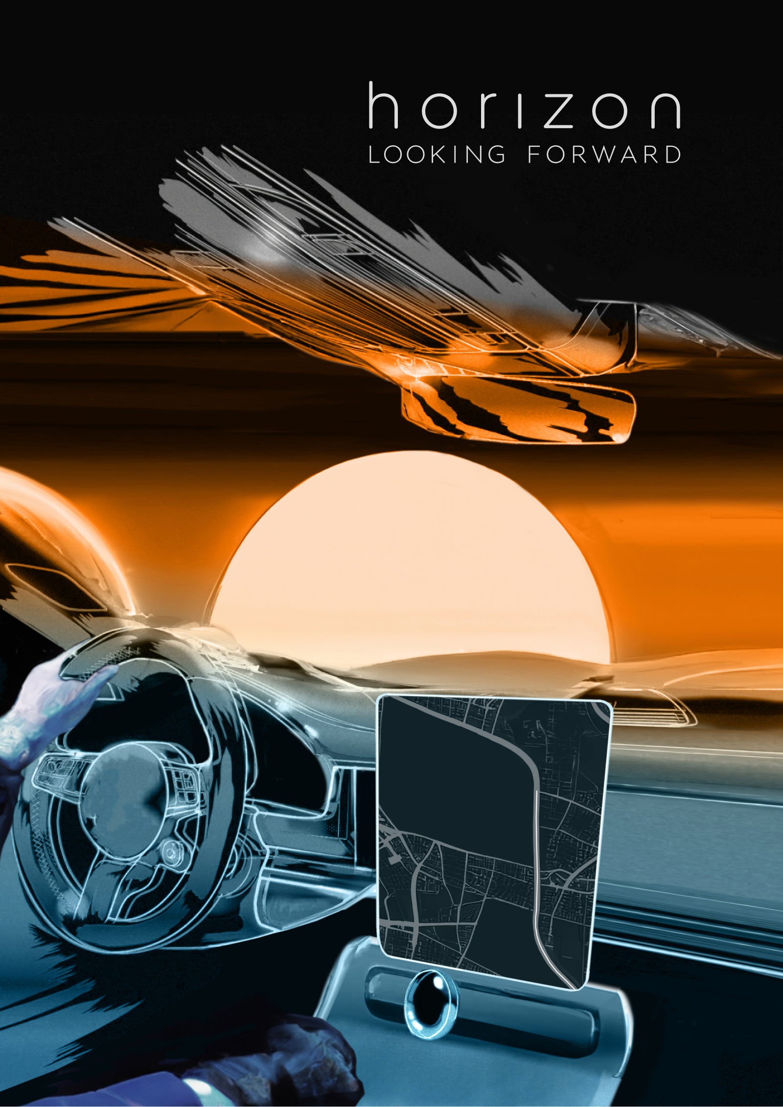
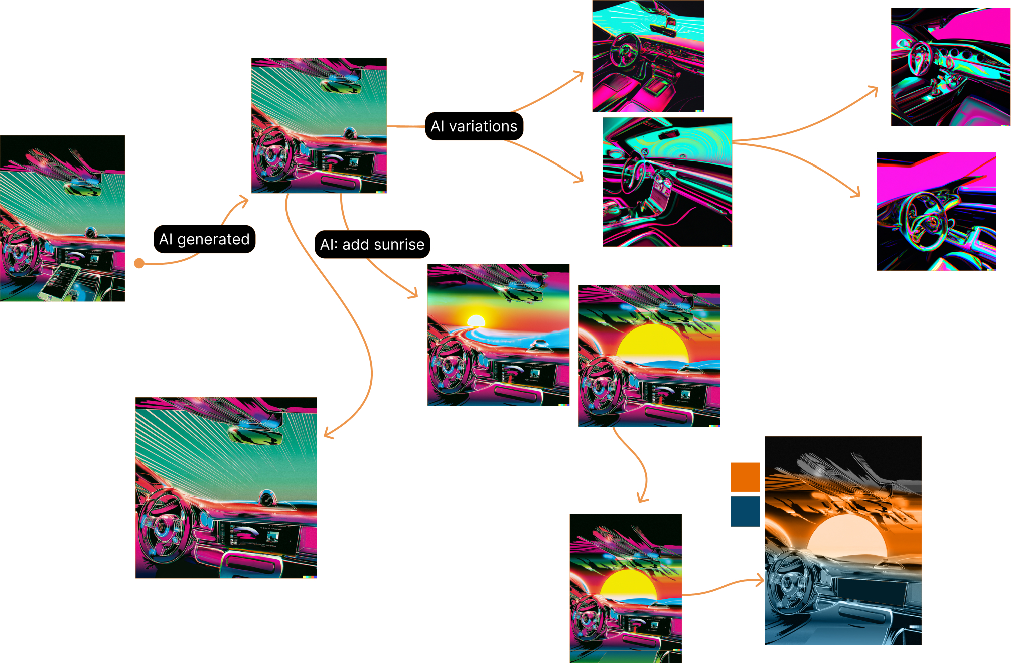
The poster for exhibition had a different aim for the team. The focus was on the brand’s core meaning and the story it wants to tell irrespective of being a driver or not. We used various visual elements and style to capture the audience’s attention and to communicate the brand’s meaning and purpose.

Moodboard
Fig. 7.12: Moodboard
Generation sequence made with Dalle-2
Fig. 7.13: Generation sequence made with Dalle-2
Horizon poster
Fig. 7.14: Poster for showcase